


I love variable fonts. I’m still new to using them in my personal projects and they still feel magical and too good to be true. This post is a quick guide to variable fonts so that you too can feel the wonder and joy of using them.
What are variable fonts?
Over the years there is one question I’ve found myself asking a lot when working through the initial design & development phases: “Do we really need so many font weights?”. With the importance of speed on our minds, we face what feels like a constant struggle between perfect design and perfect performance, and ultimately a compromise has to be made either way.
The reason for this is that standard font families come in many typesets (thin, ultra-thin, light, regular, bold, you name it). Each and every one of these that you use on your website must be downloaded by the user separately, using up their precious resources and negatively impacting performance.
So what if there was a better way that left everyone happy? With a variable font, you get a collection of styles in one single file. Put another way, you are getting all of these font variations and settings (like font weight or “slantiness”) in one bundle that you can then freely control in CSS. Rather than downloading a file for each font weight, the user downloads one file including multiple variations, and yet still with potentially faster performance. See? Just like I said, magic.

Why should I use variable fonts?
- Performance – Just by using a variable font you will most certainly cut down on the number of requests you’re making, although the individual file size will most likely go up. You’ve still got to consider the trade-offs, and ensure you implement decent font-loading techniques, but the performance may still be better with less effort. Here is a wonderful in-detail read about this by Mandy Michael.
- Design flexibility – The keyword here is nuance. Variable fonts are providing you with a whole range of variations that you can freely tweak and perfect for your site without needing to worry about the additional performance trade-off for every new variation that you use.
- Optical Sizing – Rather than just decreasing size & weight, variable fonts offer us new optical sizing options, meaning we can tweak elements within the font with specific consideration to its size. This is a wonderful tool for increasing legibility, especially for smaller font sizes.
- Accessibility – How about offering a high-contrast or low-light mode for your site? With a variable font, you can make subtle changes to the weight and grade to help you do this.
- Animation – The weights and variations of variable fonts are controlled with CSS, and just like other properties, this means that they can be animated directly in CSS to achieve some crazy effects.
How can I use variable fonts?
The key to using variable fonts is with a single CSS property, font-variation-settings. Once you’ve loaded your variable font, you can use font-variation-settings to control the exact variation that you want to show.
  .someText {
        font-family: “Work Sans”;
        font-variation-settings: ‘wght’ 500; // equivalent to font-
        weight: 500 with a standard font
    }
You can see a simple example of this here on CodePen
What you are seeing here as the value to font-variation-settings is the axis (‘wght’) followed by the value (500). There are a few more standard axes that you’ll encounter often once you start playing around with variable fonts, like wdth and ital. I’d recommend checking out the full list over on MDN along with their corresponding CSS properties. Font authors are also free to define custom axes which you’ll usually see defined in uppercase, in order to quickly distinguish them from the standard ones.
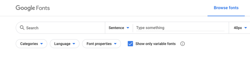
Earlier this year Google Fonts rolled out a redesign, along with an interesting new checkbox: “Show only variable fonts”. This is amazing, not only because this makes getting started incredibly easy, but because this shows that Google is also invested in this.
This means that to get started, all you need to do is:
1. Go to Google Fonts and check the variable fonts checkbox.
2. Choose your font (for example Work Sans. When selecting font weights, at the bottom of the page you’ll see the option to select the variable font version.
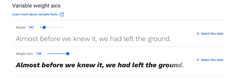
3. Embed the fonts on your site. Be aware that when adding multiple weights, you are gaining access to the full range of weights. For example, including 300;800 means you can use any weight between (and including) 300 and 800:
<link href="https://fonts.googleapis.com/css2?family=Work+Sans:wght@300;800&display=swap" rel="stylesheet">4. You are done! Use fonts-variations-settings to tweak your variation axes.
Here you can see an example of exactly this. Feel free to fork this on CodePen and play around.
Browser Compatibility
“Yeah ok, but can we actually use them in production?” Yup! Browser support for variable fonts is pretty great. They’re supported in all major browsers. Providing a fallback is also super simple with @supports. You can read about this over on web.dev.
Resources & What to try next
Don’t stop there! We’re just dipping our toes into the waters of variable fonts. There are many more options available and for a detailed read, I can recommend following the wonderful implementation guide on variablefonts.io.
If you’re looking for more variable-font goodness, I recommend checking out these articles, tutorials and videos that I collected whilst writing this post:
- Axis-Praxis: Variable Fonts in the browser – A playground for variable fonts.
- This awesome variable fonts primer from Mustafa Kurtuldu
- Mandy Michael’s collection on CodePen
- This talk by Mandy Michael’s on variable fonts and the future of web design
- The CSS Tricks collection on Variable Fonts
- One File, Many Options: Using Variable Fonts on the Web | CSS-Tricks
- variablefonts.io – A beautiful site with a whole bunch of information on variable fonts.
- V-Fonts – a simple resource for playing around with variable fonts directly in your browser.
We hope you enjoyed the read and stay tuned for more posts by Michael! As always, if you’re interested in joining the team, have a look at all our open positions, or sign up to our Hero Talent Community to stay up to date with what’s going on at Delivery Hero!


