


In this article, we’ll walk you through the importance of crafting effective error messages and share insights from our experience with the Rider app. We’ll discuss the challenges faced and strategies implemented to improve the clarity and actionability of error messages, ensuring a better user experience.
Error messages may not be the most glamorous part of app design, but they play a crucial role in the user experience. As content designers, ensuring that these messages aren’t only understandable but also actionable is a top priority. This was especially true for the Rider app.
Me, as an overachiever and obsessed with the bad error messages, of course, I had to do something about it.
Unlocking the Potential: Why Error Messages Matter
Error messages serve as more than just snippets of text; they are integral components of the user journey when things don’t go as planned. Crafting error messages that are concise, informative, and actionable can alleviate user frustration and enhance overall satisfaction with the app. Thus, content design transcends mere copywriting, playing a pivotal role in shaping user perceptions and interactions with the product.
Bad error messages can be found in every app. But what do they look like?
Here, we have a couple of different error messages.

According to your product and its voice, you can generate helpful error messages. If your product suffers from error messages that look like this, you need to get to work on them, now.
Unveiling the Errorscape
Upon joining the team as the only content designer (shout out to my solo content designers ????), I faced a big challenge: the Rider app was up and running, but its error messages needed serious work.
If you are reading this and thinking that you also need to do it, hear me out first.
If you are a UX writer or someone who is dealing with copy, the first thing you should do is discover the problem and scale your projects accordingly. This is especially crucial for teams that have only 1 UX writer on their team. We can be overwhelmed by the tasks we need to complete, and we can be overachieving at times. I was overachieving with this project, so don’t tell me that I didn’t warn you.
When a product has been out there for so long without anyone tending to its content, various challenges can arise. Among the many considerations for tackling the next big challenge, error messages stand out prominently. They were scattered throughout the app, creating chaos that needed to be addressed. Each team managed its own error messages, leading to a lack of unity. Despite the ideal scenario of having a UX Writer from the start, this isn’t always the case. The app may already be operational before there’s a chance to refine the error messages. By the time a dedicated team is in place to address them, a backlog of content issues may have accumulated. This was the situation I encountered when joining the Rider app team, which was already live and operational before my arrival.
Even though I do love a challenge and adore fixing error messages, they are also tricky. To tackle error messages and increase understandability and actionability for our app, I needed to come up with a solid plan.
Divide and Conquer: A Methodical Approach
Our team is huge, more than 100 people work on the Rider app. We have teams to cover every aspect of our product. As a UX Writer who works with two different tribes, I knew focusing on the error messages would be difficult. That’s why we needed to come up with a plan where we would get results and also create a roadmap for the future.
We started with what we could achieve. We kept our OKR simple. The best thing you can do for yourself when you’re a solo UX writer is to be clear about the expectations both from your team and with your manager. You know your craft better than anyone and trust yourself to pave the way for your success. Your OKR can be as simple as focusing on one aspect of the app. Let’s say, you have an app that lets you order outside. Then you start with the checkout errors. It’ll help a lot of people to have an error message that helps.
Build the Team: Collect champions from teams
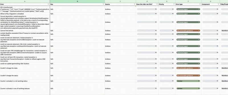
To continue, I needed to collect all the error messages in one place to have an overall understanding of what I should be working on. This was the most time-consuming part of the process. The error messages we had weren’t saved in one repository, so I needed to find people to help gather the error messages into one file. At that point, I listed the people I needed: the PMs of the squads that our OKR aimed for, the engineers of those squads, and the group and engineering managers.
I asked our tech team to help me find the files for the error messages. I downloaded the files that were necessary to collect error messages from Github and checked our translation tool to see if there were any missed error messages.
I categorised all of them in the sheet and deleted the duplicates. Then gathered them all into one place where I started to categorise them.
Priority was to understand if that error message was a blocker in Rider’s journey. If that was a definite yes, then the message would be a high priority.
Error types indicated the problem with that error message. For that, I labelled the error message as generic, unclear, technical jargon, had no actionable guidance, and so forth.
The place where the error message shows itself is also important when doing this kind of collection. We can treat the error that shows itself in a toast message the same as the one that comes up as a pop-up. So collecting the component of the message is also critical to work without friction.
The status of that error message depends on how your team works. I categorised them as need context, editing, ready, postponed, deprecated, and done.
If you’re going to dive into error messages as well, know that you can’t fix every single one of them. So, go slow and systematically. It won’t be done in one sitting.
Prioritisation: Which errors get edited first
Once I finished creating the repository of the messages, it was time to ask for help. This consisted of spamming people on Slack. Of course, I’m half joking.
Since we had many error messages to go through, we needed to know which ones belonged to which squads. I reached out to each PM and engineer who was in this project to go through the sheet and identify the ones that belonged to them. After that, they needed to prioritise each message.
When they were done, I asked the important questions of “How can a user fix this?”, and “Can they fix it?” and maybe one of the biggest and the most important questions “Can we fix this?”. The best way to release the user from the stress of an error message is to get rid of it altogether.
This opened up long conversations around the error messages and how content design is approaching them. The safe option of “something went wrong” became the most annoying sentence, which was great as I aimed to give everyone the realisation of the depth of the error messages and how we can help the users.
Crafting the error messages: More than words
There are some great guides on how to craft an error message that helps the user instead of creating a more stressful situation. You can’t go wrong by following this structure:
- Tell the user what’s wrong: try to avoid generic messages like “something happened”
- Then tell them how to fix it: don’t leave the user hanging dry. If the solution is to refresh the page, then tell them to refresh the page.
Of course, that would be great if it was this simple, right? Here are some things I learned along the way that frustrated me. I’m sharing this with you now so your frustration isn’t surprising.
- You can’t be 100% transparent and helpful to the user for security reasons. It would need you to create a more generic message.
- Some “Something went wrong” messages will stay like that because it would be another quarter to figure out what’s going on there.
- Along the way, you might realise that that message could be avoided, but it means a new flow in the design. You can release a silent scream. It’ll help.
Your tone is also quite important to ease the situation for the user. While I was rewriting the messages, I saw exclamation points, using “oops” or just giving them a code that only our tech team can understand.
To help the team craft the error messages according to each situation we had, I crafted a diagram to figure out the tone.

This diagram will come together once you go through what kind of messages you have on your repository. Some messages may be the system, and some messages may be caused by the user. Once you categorise them, you can figure out the path the user is on and what they might feel at that point. For example, when there is an error, you might tend to apologise. On this diagram, we know that we’ll say “sorry” when the friction level is horrific. That could be an error stemming from the system, leading to the loss of everything the user has achieved so far. Then go ahead and apologise.
Team effort all the way: We’re in this together
This scale of a project wouldn’t be possible if there wasn’t support from everyone on the team. So try to get other team members from product and tech excited about this. And note that, one way or another, everyone is aware that error messages need to be edited. If your team is also obsessed with them, it makes things a lot easier.
Additionally, seeking external assistance to resolve more complex issues can be beneficial. Collaborating with other teams or stakeholders who have insights into the underlying technical aspects can help streamline the process. Remember, you don’t have to tackle everything alone, and leveraging external expertise can lead to more effective solutions. By fostering a culture of collaboration and open communication, we can overcome obstacles more efficiently and ensure a smoother user experience overall.
Navigating the Error Terrain
Error messages can be daunting as there are lots of unknown parts that you need to discover. I’ll wrap this up for you as a TLDR so that you know before you start.
- Scale and search before jumping into the task.
- Learn who you’ll be working with and onboard them about what you want to achieve.
- Use what you have. I used Google Sheets to collect the messages, and Figma to see them on the design.
- Less is more. Set an achievable goal FOR YOU so you can manage your workload. This won’t be the only thing you’ll have to work on.
- You can’t fix every “Something went wrong” message. Sorry.
- Ask for help, raise the flag, and pave the way for the future.
- Breathe :). It’s okay to feel overwhelmed. Speak up and let others know.
Oh and, we successfully achieved the OKR that we set for this project, and it opened different conversations that we’ll pick up in upcoming quarters, stay tuned for more! I’m so proud of this initiative, it was quite challenging but so rewarding.
Although it’s a success we celebrate and achieve, we know that we have a long way to go. We learned from this project a lot and now it’s scalable for another one. Good luck if you’re working on error messages as well. Let me know how it goes!
???? Sources that helped me with this initiative:
- Error-Message Guidelines
- When life gives you lemons, write better error messages
- Content design: How to write any error message
- Error message
If you like what you’ve read and you’re someone who wants to work on open, interesting projects in a caring environment, check out our full list of open roles here. We’d love to have you on board for an amazing journey ahead.


