Redesigning Delivery Hero Rider App: ‘Lasagna’ Style – Fresh, Fast, and Full of Flavor!
Get ready for a journey through empathizing with our riders. In this article, we’ll take you step by step through our redesign of the Rider App for all Delivery Hero brands.
Going Beyond the Limitations
Over the past few years, Delivery Hero has been growing rapidly, not only in demand during the COVID pandemic but also in its ever-evolving ecosystem of products and services. This rapid growth brought the Rider App to a point where it urgently needed transformation, and here is why:
- As we kept shipping new features, the cracks in our information architecture started to appear. We had piled up features for riders without many improvements in the top-level UX frameworks. At the speed we were shipping, we quickly reached a state in which we had hit the limit of the current design. It became evident that we had to press the reset button to support future product development and start fresh.
- We had all the GPS and location-based tech to support our operations and business logic. But riders weren’t truly benefiting from it in the app. It was time to put the map at the centre of the design.
In 2022, a cross-functional team of Berlin-based experts took on the task of revamping the Delivery Hero Rider App’s information architecture and design.
Bike Diaries: Hitting the Streets
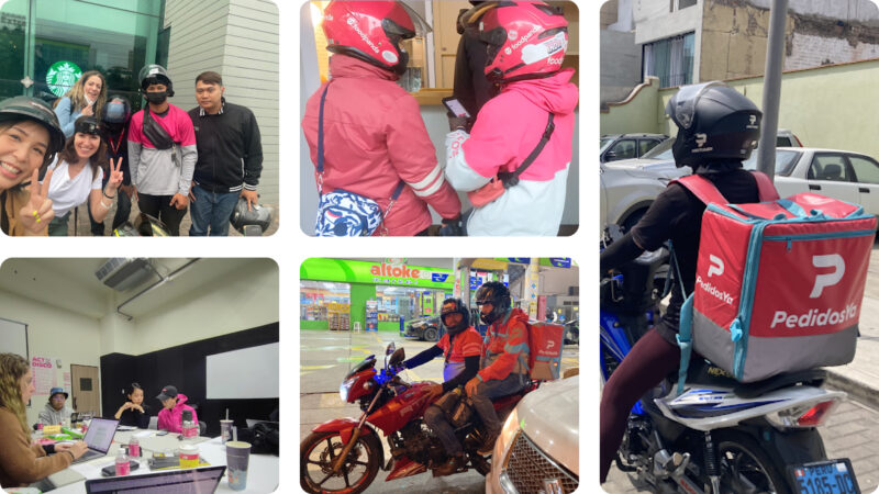
To truly grasp the world of riders, we embarked on a rider journey. We hit the streets, immersing ourselves in the hustle and bustle of their daily grind. We needed more than empathy; we needed firsthand experience to ensure our software could be their unwavering ally in the face of adversity.
Our mission? To make that journey a little smoother.

We used three guiding concepts to revamp the app, which was inspired by our road trips and close teamwork back in Berlin.
We aimed for an app that’s:
- Contextual: Show what matters to riders now.
- Prioritized: Get distractions out of the way and help them focus.
- Proactive: Don’t make them think or interact, anticipate their next need.
Redesigning Content Structure and UI Model: The Lasagna Architecture
Our observations revealed that the current content structure wasn’t serving riders’ goals. We expected that prioritizing content based on rider state would improve both the rider experience and business KPIs. Enter the Lasagna Architecture, a layered user interface model created through intense collaboration.
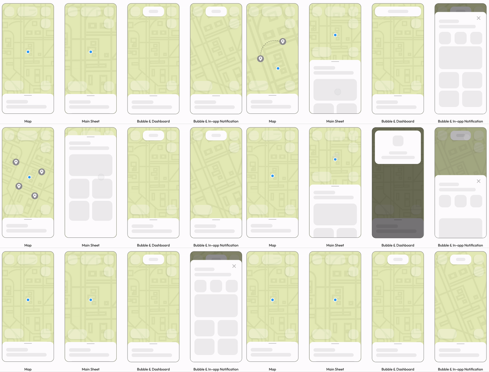
This UI style aids in progressive disclosure, focuses main material, reduces context switching, and simplifies the rider experience through a map-first approach.
To get deeper into the Lasagna Architecture, let’s look at each layer and how they work together to create a new navigation model.

Layer 1: Map Canvas
We use the map canvas to display all geographic data, such as locations, routes, delivery zones, and heat maps. The map is interactive, adapting its content, zoom level, orientation, and perspective to meet the contextual needs of riders.
Layer 2: Floating Components
Utilizing floating components for map functions, controls, buttons, or links. We’ve introduced a new floating component called the Bubble, which provides real-time updates on rider’s working status and earnings. It can also transform into In-app Notifications that deliver contextual messages.
Layer 3: Dynamic Sheet
The Dynamic Sheet (or Main Sheet) serves as the host for the essential content that riders require to fulfill their tasks. Riders can decide to fully expand it, make it partially expanded alongside the map, or minimize it to have a bigger map.
Layer 4: Modals
Modals, pop-ups or sheets that appear on top to disclose secondary content on demand or deliver critical information when necessary. To offer additional insights to riders, we’ve introduced a new sheet called the Dashboard. It opens when riders tap on the Bubble.

Using the Lasagna Architecture, we intended to design a user-friendly UI that is tightly linked with the rider’s journey.
The new design and navigation model would not have been achieved without close collaboration among a wide group of experts and stakeholders. We held numerous workshops, reviews, critiques, and revisions to build a concept that corresponds with our understanding of riders’ needs and meets the requirements of stakeholders.

Getting Everyone on board
In large organizations, designing and building a product is just a part of the challenge. The real feat is getting buy-in and alignment from internal stakeholders and partner teams. Organizations tend to be cautious about changes, fearing potential risks and negative impacts on business metrics. So, we took our new designs on a company-wide roadshow, presenting our vision and strategic plan to everyone from product teams and local and regional ops teams to design systems and user research, all the way up to Delivery Hero’s Chief Product Officer.
We didn’t just rely on ordinary slide deck presentations; we showcased the transformation from old to new and painted a vivid picture by illustrating concepts and creating high-fidelity interactive demos of our vision and outlining an incremental, iterative plan to achieve it.
We fostered open discussions, actively sought valuable feedback, and refined our design to ensure alignment with Delivery Hero’s broader objectives. This collaborative effort ensured that our redesign not only met our immediate needs but also contributed to the company’s overarching vision.
Prototyping and Validating with Riders
After numerous iterations, when we were confident that our designs had reached a level of maturity, we put them to the test.
Before committing significant resources to implementation, we developed interactive prototypes and conducted testing sessions with actual riders from the Delivery Hero brands. Our goal was to determine the usability and overall satisfaction with the new design. This early validation process provided invaluable insights and revealed potential risks that we promptly addressed.

Micro Features: Building Blocks for the Future
Our decision to develop micro-feature architecture was a game-changer. 15+ engineers across 9 squads came together to embark on this transformative journey. Our goal? to create self-contained, portable UI components that seamlessly adapt to any host with minimal integration effort. This architecture allowed us to craft highly dynamic screens, adapting to the user’s context with micro-feature components. A minimal integration footprint meant teams could still collaborate on a single screen while delivering their own features.
This architecture promises to transform how we create mobile apps, making them more dynamic, context-aware, and user-friendly.

What are micro-features, you ask? They are:
- Self-contained: These little powerhouses populate their state, depending on data sources.
- Host-agnostic: Designed to work on any host, provided it has the bare minimums.
- Easy to add/remove: Minimal integration footprint means they can be slotted in or out with ease.
- Meaningful as a unit: Each one serves a meaningful purpose and has a single, clear responsibility
It’s not just about coding; micro-features represent a transformative mindset shift towards modular and scalable app development. They empower developers to focus on specific functionalities without disrupting the larger app ecosystem.
And it’s not just developers who benefit; designers also find newfound freedom. They are empowered to design contextual hosts without worrying about isolated or screen-bound components. This liberates them from unnecessary constraints and allows them to aim higher.
With the New Structure, who Owns and who Builds what?
In our quest to redesign the Rider App, we quickly realized that it wasn’t just the app interface that needed a makeover; our team structure did too. The way we collaborated, owned, and built new features needed to evolve in line with our new content structure.
Some organizations traditionally operate on the assumption that one screen equals one squad. However, we believed that this approach could lead to fragmented user experiences. We aimed to break down these screen-based barriers between squads and give teams the flexibility to craft a more thoughtful and unified user experience.
To achieve this, we proposed and established a new collaboration and ownership model that was deeply rooted in purpose. Here’s a breakdown:
- Ownership: Each host of the Lasagna Architecture should have a dedicated owner. For example, Main Sheet, which hosts essential information and primary CTAs, should have a dedicated team responsible for its implementation, performance, optimization, and usability. However, the content can be sourced and owned by other teams.
- Cross-Squad Collaboration: Teams should no longer necessarily be bound to specific screens. Instead, they can own specific hosts as well as individual content pieces or micro-features in other hosts that contribute to their business KPIs and northstar metrics. This approach allows the teams to tap into the expertise of other teams and foster innovative and collaborative culture.
- Shared Vision: Alignment is not just a buzzword; it is a shared vision across teams. Every team should follow the overarching goals and figure out how their contributions fit into the bigger picture.
It was just the beginning, the ride continues!
We’ve served our lasagna to riders across the globe, and the feedback from riders has been incredibly positive. Riders appreciate the contextual, prioritized, and proactive design that simplifies their work and empowers them to perform at their best. But, this is just the beginning.
Our journey to improve the Rider App is far from over. We have a slew of fantastic features lined up, all aimed at delivering more value to riders worldwide and taking Delivery Hero’s rider app to the next level.
If you like what you’ve read and you’re someone who wants to work on open, interesting projects in a caring environment, check out our full list of open roles here – from Backend to Frontend and everything in between. We’d love to have you on board for an amazing journey ahead.


