How we redesigned our vendor-facing application “Go” and what we learned along the way.
At the end of 2019, our design team started the redesign of our vendor-facing application called Go. Our vendors use Go mainly for order processing and its supporting functionalities (e.g. inventory management, schedules, etc).
When our design team began the redesign project, we had several issues we needed to overcome. However, the biggest one was to get a clear understanding of the application (as it was built way before my colleagues and I joined Delivery Hero). We also needed to understand its usage, user needs, and what we should expect during a redesign. Below I explain the biggest learnings we made along the way.
1. Plan ahead
Before we even started to do any kind of exploration work, we aligned with our stakeholders on a deadline for the first big milestone. The initial concept was supposed to be finished within three months. That was quite challenging, as there were basically only 1.5 designers working on the project at the time. Due to the tight deadline, we laid out a design roadmap, which included milestones we needed to achieve. As it’s sometimes difficult to stop ideating and exploring, we were fairly strict on our deadlines and tried to timebox our tasks as much as possible.
Right from the beginning, we wrote down our goals. In one sentence, we described what we wanted to achieve and what we should consider when creating the initial version. This was very helpful, as we were always able to go back to it and review whether or not we were still on track.
In order to plan all of this, we asked ourselves a few questions, which we tried to answer with the help of stakeholders:
- Why do we need a redesign?
- What do our users like about our current application?
- What is currently not working well in the application?
- What do our users expect from a redesign?
- What do other stakeholders expect from a redesign?
- What are the technical restrictions?
- What is the timeline?
- Who needs to be involved?
Having answered these questions, we were able to finally start on our “drawing board”.
2. Show, don’t tell!
When we started the project, many of our colleagues had trouble envisioning our desired end result without any visuals. Even with a written goal, many people were not able to visualize how different our application could potentially look and feel. This was not just another feature we would build with a clearly defined KPI we needed to improve, but rather an abstract goal that would potentially improve several KPIs and user needs. Therefore, it was initially harder to get input and involvement from the people around us.
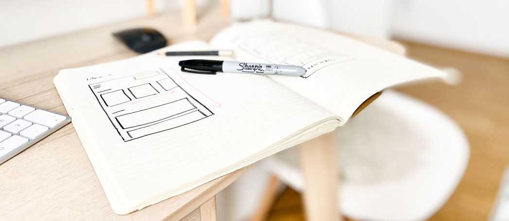
This experience taught us that we needed to show as much visual content as possible in order to get our idea across. We showed sketches and rough mockups early on, and shared presentation decks on a regular basis. A personal highlight was when one of the backend developers, who was rather quiet up until that point, told us how excited he was about it, as the mockups helped him to understand the overall idea.
Showing our ideas was definitely a helpful way to get people on board. It also sparked conversation around the new design.
3. Get feedback
Whether it’s a redesign or creation of a new feature, getting feedback is key. Not just from stakeholders, but also from users.
As we were working on an application that is used by thousands of users on a daily basis, we needed to ensure that any changes we made, made sense. In order to do so, we showed our early outcomes (information architectures, sketches, mockups, etc) to stakeholders, asked for their feedback, and tried to implement as much of their feedback as possible.
Before we had even shown it to vendors, we had already iterated a few times. This was crucial for us, as our users are not based in Germany (where our central office is) and we could not simply ask “anyone” due to the vendor’s very particular needs. However, after receiving internal feedback, we ran exploratory research with restaurants to hear their opinion. We discussed their impressions about the current application, and later ran a usability and preference test (testing two different versions of a new design).
During the preference test we asked whether they preferred one of the new versions, or the old one. We were happy to hear that roughly 80% of the vendors preferred to see one of the new versions live. As people are often resistant to change and prefer to keep things as they are, especially when being used to a certain flow, this was a great result as it indicated that we were on the right track. Based on the feedback we received, we went forward with one of the new design ideas and finished the initial version.
4. Keep it clean
When building a new design, it is crucial to work clean and be consistent, especially when working with several people. We learned this the hard way, as the old design only had local components, which, more often that not, were not linked to a proper library. This led to many inconsistencies and usage mistakes.
During the redesign, we created a component and token library so that we could reuse as many elements as possible. Even though it initially took a lot of effort, it paid off in the end, as it was easier and faster to build components, screens and users flows later on.

As our team grew in the last year, it also benefited us in that new joiners were able to get to work very quickly. Along with components and design tokens, we also defined naming conventions and created a rule set on how to keep our files clean. This is now used as a checklist, before adding new designs to our master files.
5. Iterate (even on redesigned items)
We decided to roll out the new design as fast as possible. However, that meant that our users could see an application that only partially used the new design, as some features had not been redesigned yet. From a designers perspective, that was hard, as it felt odd to roll out an inconsistent experience.
However, we learned that it provided the benefit of early feedback on the new live version, both from users and stakeholders. We were able to iterate on features we just redesigned, in order to make the experience even better. Additionally, we applied this new knowledge to other parts of the application that were still to be redesigned.
Conclusion
Altogether, we are very excited about the new design and happy with the learnings we made along the way, especially regarding collaboration and communication.
As a learning for the future, we would definitely use even more and faster validation methods, such as unmoderated validation tests through online platforms, as we spend a lot of time on in-person validation. We also learned about the importance of collaboration with our BI and operations departments in order to get data insights for designs.
As a digital product is never really finished, we will continue to gather as much user feedback as possible to ensure our vendors are happy with our application.
Thank you Wioleta for your insight! As always, we are still hiring, so check out some of our latest openings, or join our Talent Community to stay up to date with what’s going on at Delivery Hero and receive customized job alerts!


